
EIR Forum
Only a Scientific and Cultural Renaissance
Can Stop the New Dark Age
January 2016
 Thomas Wysmuller. |
Thomas Wysmuller's Presentation
Thomas Wysmuller gave the following remarks to the EIR Forum at the National Press Club on January 26, 2016.
Mike Billington: OK, ladies and gentlemen, that's a good sound system. I appreciate that some of you, at least, braved the difficult weather to come out. We had a lot of other people who'd planned on coming, but who couldn't get their cars out of the drive, and such things; showing once again, the great infrastructure in the United States of America, which needs some help, to put it mildly.
I'm Mike Billington. I'll be chairing this. We're going to have presentations today, sponsored by the Executive Intelligence Review. We'll have presentations by Mr. Tom Wysmuller, who is a climatologist, a meteorologist, who was educated at New York University, in the Royal Dutch Weather Bureau in Amsterdam, and worked for five years during the peak of the space program, in different departments, and subsequently developed some mathematical models that are used by climatologists around the world; and was part of the founding of an Institute called The Right Climate Stuff, of mostly NASA scientists and climatologists and meteorologists, whose purpose is to counter the lies, and the fraud about the entire global warming hoax.
He'll give an opening presentation, and then, Mrs. Helga Zepp-LaRouche, the founder and chairwoman of the international Schiller Institute, the head of the Bürgerrechtsbewegung Solidarität Party in Germany, a Chancellor candidate. And she'll address the general global economic crisis, the battle that we are involved in to try to prevent the outbreak of world war, and the collapse into global financial disaster that we're now experiencing in the United States and worldwide.
Tom Wysmuller will speak first....
Tom Wysmuller: OK, if you can follow the slides, that's great. I'll tell you which one it is. OK, if I'm going to be first, do I need a mike? All right, if I'm going to be first. Slight correction on the introduction: the TRCS group is a group of mostly NASA retirees, but some current employees.
Q: I'm one.
Wysmuller: Hey, congratulations, that's great. Who were at one point or another based in Houston, but we're not anymore. I live in Maine, and we've got some people in Connecticut, and they're all over the country. Our purpose was to explore the science. It wasn't to change anyone's mind, in the sense that we were not advocating a pro- or anti-CO2 position. We were just exploring the science. What we do, is we hold meetings there every couple of months; have a good time doing it, because we're preaching to the scientific choir. And again, we're Apollo astronauts, NASA engineers, scientists. I'm one of the meteorologists. The other thing is, when we speak, we don't represent TRCS. We represent ourselves. So we have differing opinions within The Real Climate Stuff group. They tend to be very focused on valid science, validated models, but we are each speaking on our own.
Now it turns out, you're holding a package that has a logo of the International Symmetry Organization. You're actually seeing slides that I was planning to present in Vienna, sometime this summer, at the International Symmetry Conference, and there I'll be speaking about Ice Ages and things like that. But that's their logo. They do not endorse these slides. All right, these are slides that I'm using, and many of them aren't even mine. I'm using in an actually professional way, to present slides at a conference, where you have the logo of the conference there. So you're getting the first look at these slides, because nobody else has seen them.
Click on any slide to view large size
Slide 1
 |
Slide 2
 |
So let's look at the first one. The first one, it says, "Sea Level Rise and CO2: Is There a Cause and Effect?" Cause and effect would mean does a rise or fall? And one increase or decrease the other? So, we're going to explore that.
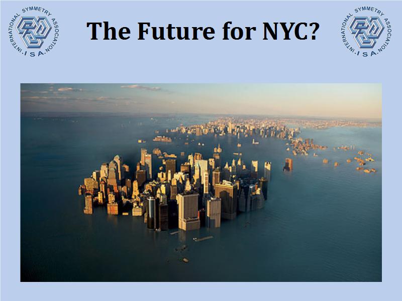
The next slide shows what, many people are saying, is the future of New York City. This happens to be the book jacket of a book by a person who claims to be a meteorologist. It's great for selling books. But I'm going to tell you one thing: Not in your lifetime, and not in the lifetime of any of your descendants, is this going to happen. By the time I finish, I think you'll figure out why.
Slide 3
 |
Slide 4
 |
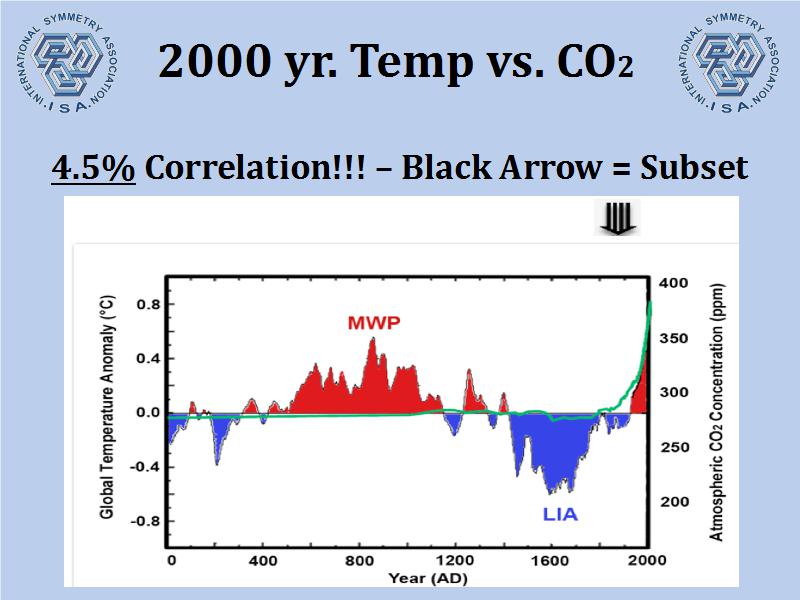
Let's go back a little bit. The next chart, you'll see it's titled, "2,000-Year Temperature vs. CO2." What you're looking at, is, CO2 is the green line, the green line crossing the center; and, for most of its trajectory into the present, it was running around 280 parts per million of concentration in our atmosphere. In fact, if you go back almost 10,000 years, that's what the CO2 has been. It's been unusually steady and level, over the last 10,000 years. Now here you see 2,000 years, but you notice, in the center, you have the medieval warm period, where temperatures shot up. And then we descended into the Little Ice Age.
By the way, during the medieval warm period, the Vikings were able to colonize Greenland, grow crops there, and make a small colony. When the Little Ice Age began, that was it. They were frozen out, and they left or died, I'm not quite sure which. The Little Ice Age was a period where we had low temperatures, temps frozen in the winter, the canals in Holland froze, people skated all over them. If you look at the Dutch Masters, you'll see lots and lots of paintings of these winters. Notice CO2 unaffected. CO2 did not affect it.
So now we exit the Little Ice Age, and at the top of the graphic, you can see a black arrow. I didn't pick black for any particular reason. It's just an arrow showing where the subset starts.
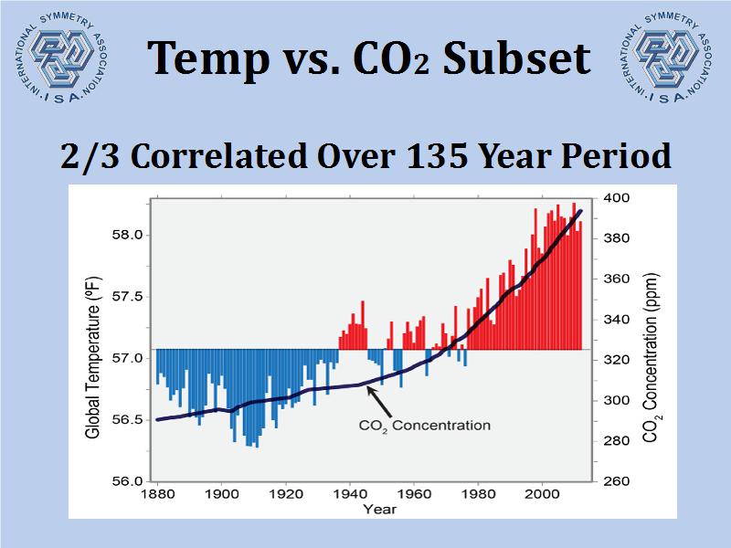
And then on the next page, you'll see the subset, and it says "Temperature vs. CO2 Subset." Now you notice, on the graphic before, you had a 4.5% correlation over the 2,000-year period, that we were measuring both temperature and CO2.
The next graphic, the Temperature vs. CO2 Subset is lifted straight from the National Climate Assessment. This is this 800-page, some science and some fiction, that the administration put out last year, National Climate Assessment. And this graphic comes from there. And they're showing that CO2 is rising; but you notice, for the first third of the page, temperature is actually falling, even as CO2 rises. And then finally, CO2 rises in tandem with the temperature, and there you have correlation.
But you probably figured out already, the correlation is not causation. The fact that two things happen at the same time, does not mean that one causes the other. But we do have a good correlation. It's been used by the Administration to show, look at CO2, look at what it's doing to the temperature. It's not doing much to the temperature, by the way.
Let's turn the page.
Slide 5
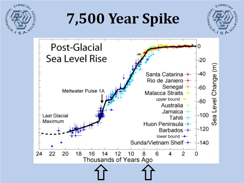 |
Now we're going to go to sea levels. You're looking at sea levels over a 25,000-year period, and most of the sea level that increased, did so during the 7,000-year period; the chart is titled, "7,500-Year Spike." Basically, what's happening here, is that the sea levels are rising, because the Ice Age, the 100,000-year long Ice Age ended around 20,000 years ago. And the way it ends, is by these giant glaciers, these continental glaciers, huge, 2, 3, 4 miles deep in some places, all melted. Now by the way, and I'm going to refer to this in the future, ice is heavy. If you take a cubic meter like this, this is a cubic meter of ice. Anyone want to guess what it weighs?
Q: 2,000 pounds.
Wysmuller: Exactly. One ton. OK? And if it was water, by the way, it would be 2,240 pounds.
Q: They used to teach this at West Point.
Wysmuller: I am very pleased to see that your memory is nicely intact.
Q: I learned it from a guy named Buzz Aldrin.
Wysmuller: Buzz is one of the good guys. Let me talk about him later, too.
All right, anyway, when this ice, you have two miles, then melting to one mile, then a half a mile, a quarter mile, where does the ice go? The water goes in the oceans and you see the sea level rising. And it rises at a fairly rapid rate for about 7,000 years, and then kind of stops. Now why does it stop? It stops because the giant continental glaciers that covered Asia, Norway, Canada, part of the United States, were gone! They disappeared about 8,000 years ago. And that's it!
The rest of the rise of sea level, and it still is a tending trending rise, is due to the remaining mountain glaciers here and there melting into the ocean. Occasionally some of Greenland and Antarctica would melt in the ocean, but it is very steady. And much of it is due to thermal expansion. Because in this same period of time, the oceans are getting warmer, and as the molecular motion in the oceans increases, the space between the molecules increases, and you actually have a rising sea. But it's a slow, steady, methodical rise.
Slide 6
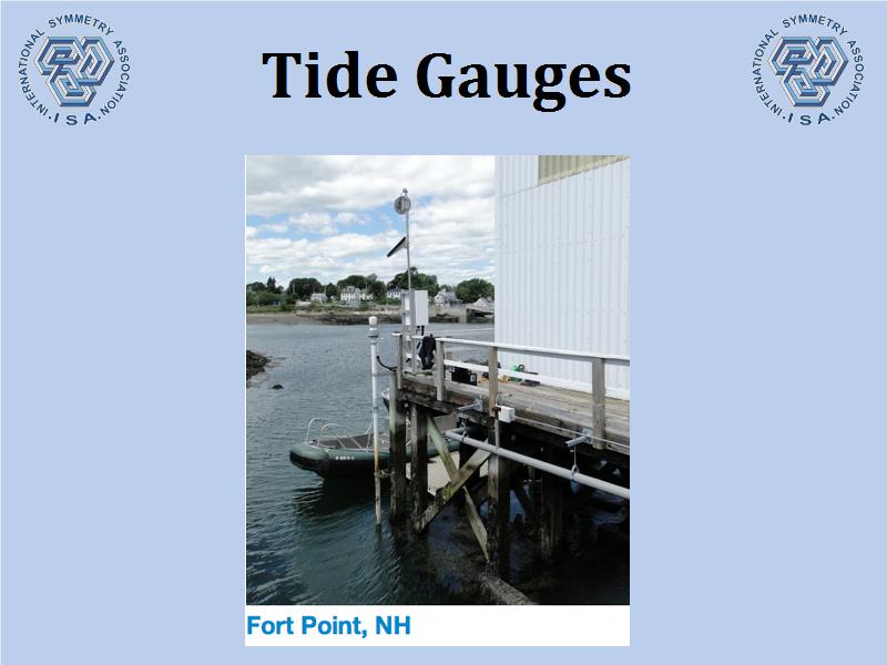 |
So how do we measure that? The slides that you didn't see, that I'm not going to talk about, talk about satellite measurements and other things. But the primary vehicle that I use, which is reliable, is the next slide, is tide gauges. And tide gauges, here you see the tide gauge at Fort Point, New Hampshire; The gauge itself, by the way, is anchored to the bedrock, and it's loosely tied to the pier. Now the tide level in Portsmouth, happens to vary about 9 feet per day. It's fairly high rise, and low rise. But what they do is basically they take the average, and over a long period of time, you have a pretty good reading of what the sea level is.
However, there's a bias in tide gauges, and the next slide will show you that. It's titled, "Tide Gauge Bias." All right, the next one shows you a distribution of tide gauges around the world, in places where the land is ascending. In other words, you have land actually rising. A great example is Norway, and I'll talk about that in the next slide. When you remove 2, 3, and 4 miles of ice and weight from the ground, the mantle of the Earth actually pushes up, and the land rises. So if you live in Norway, you're saying, hey, the sea level is falling at 7 millimeters a year! The sea level's not falling, Norway's rising. If you've ever been to Norway, and you see the way the mountains are developing, you understand that.
But places like Holland, which have been sinking, Norway rises, Holland sank. They have lots of tide gauges in Holland, because they're very worried about the sea level rise, or the land drop. They haven't figured out the land drop yet; but it is a sea level rise as far as the Dutch are concerned. And they build dikes, and they take care of it. One of the oldest tide gauges in the world is in Amsterdam harbor. In the 1600s they had a running tide gauge, and they kept really good records.
The distribution of these is skewed on a worldwide basis to the places where sea level is rising, otherwise known as land is falling. Places like in New York City, you have a very steady, linear sea level rise, about 2.5 millimeters a year.
Q: Which graph is this one?
Wysmuller: It's not. I'm telling you just a fact about New York; and Boston also shows a sea level rise. The single unifying aspect of this, is that both of those cities have a fair amount of skyscrapers. Boston's are relatively new, about 19 or 23 up since 1960, so in the Boston sea level record, you see it going steadily up, and ending up in a different direction. New York City has been building buildings on this bedrock for many, many years, and there is a slow sink, so the New York City tide gauge is not -- and I'm going to define the term here -- tectonically inert. Tectonically inert area is a place in the world where land neither rises nor falls. Boston has one quite near. It's called Portland, Maine. And Portland, Maine, has shown a very steady linear sea level rise, however, it's minuscule. In the end of 2014, the sea level in Portland, Maine, read identical to the millimeter, to what the sea level was in 1947. And that wasn't even the highest reading in 1947. It's in the same body of water as Boston. Portsmouth, New Hampshire, shows a minimal sea level rise. Why? There's no skyscrapers there. So Boston is sinking.
Slide 7
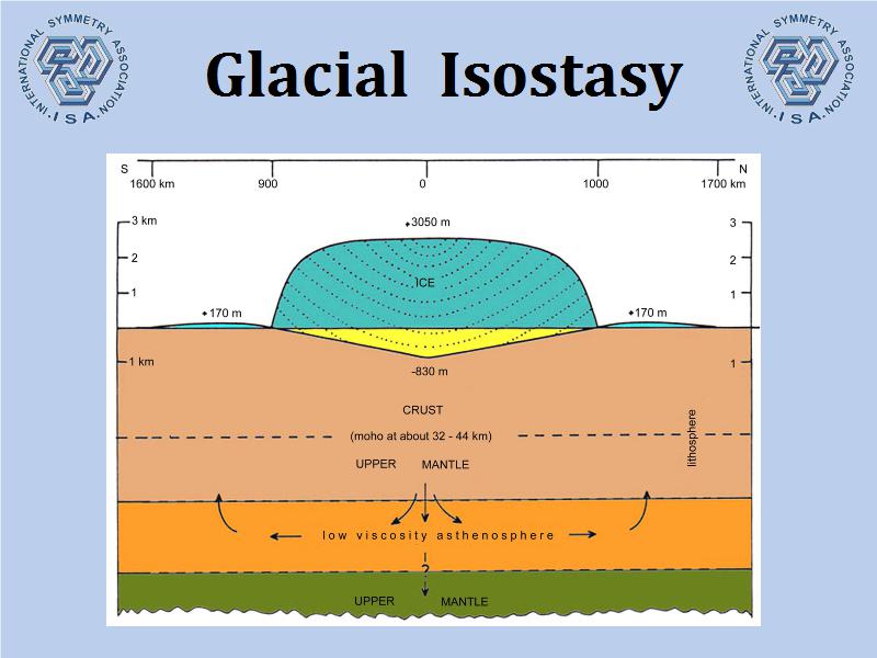 |
We know we have a bias in tide gauges, let's look at the next page. And now we're going to get into the tectonically inert definition. Isostasy is the balance between what's on top of the land, and what's underneath it, and it looks like this. It looks like a big, blue lump on top of a slide.
This was done by the great Axel Mörner. Axel Mörner is a Swedish oceanographer, one of the best in the world. He did this diagram. You notice, while there is ice over Norway, it is pressing down. The yellow part is what's pressing down. And on the edges, in the thin blue bulges you see on the edges, is where the land is deforming upward. It's being pushed on; it has to go somewhere. When the ice melts, all of a sudden the land rises underneath that yellow part.
Slide 8
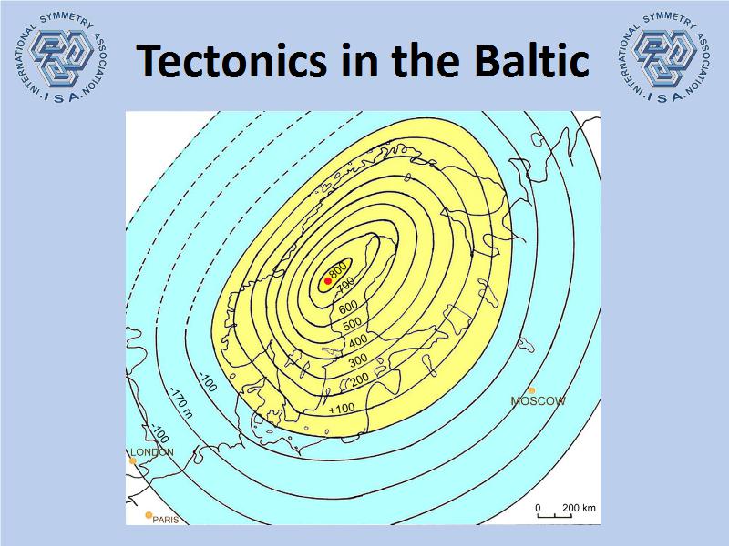 |
The next slide looks like this. The areas here, the yellow and the blue are equal deformation. In other words, the yellow area is where land has risen over the last 20,000 years, and the blue is where it has subsided. And the, I guess you call them [s/l iso 18.27] levels around here indicate the extent of the deformation. In the center of Norway, the mountains that were built there, rose almost 800 meters. It's huge. Over 20,000 years, it's a long time.
Down in Holland, and you see that at the lower left, about 2 lines in, you had the maximum sinking of the ocean basins. The ocean basins actually enlarge, so when you have that sinking in the land, the ocean actually is able to absorb and handle more water. And of course, where did the water come from? It came from the glacier that melted.
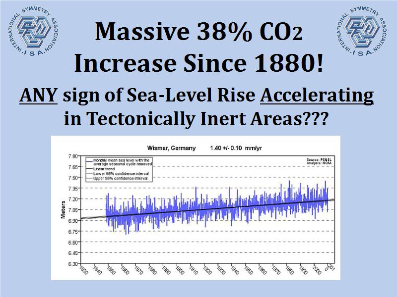
In between that is a zone, again, is right on that line, which is tectonically inert. The land is neither rising nor falling. The one that had the best tide record, going back about 135 years, was Wismar, Germany. Wismar is in the Mecklenburg Bend of the Baltic, and it is about, you have to interpolate from the line that is separating the yellow and the blue. You go down about 80 meters, and you'll find Wismar, Germany. Over a 20,000 year period, that 80 meters translates into about, maybe 4/10ths of a millimeter per year. You can do the division. It's not that hard. So Wismar is almost tectonically inert, but pretty close.
Slide 9
 |
Slide 10
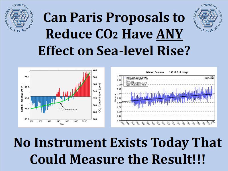 |
If you look at the next slide, you'll see we've had a massive 38% increase of CO2 since 1880, and in a tectonically inert area like Wismar, you see no signal whatsoever, of any acceleration in sea level rise. None! Again, the real increase In Wismar is probably about a millimeter a year, because the 4/10ths is due over the 20,000 years to -- you have to take the subsidence into account. Portland, Maine, the tide gauge looks almost the same. Again, it's tectonically inert, and that's how you measure the real sea level on the planet. You find places that don't move up and down, and that's where you measure the sea level.
The next slide says, "Can the Paris Proposals CO2 Have Any Effect on Sea Level Rise?" Now we've had a 38% increase without any evidence at all of acceleration in sea level. If the Paris proposals can reduce 0.5% or even 1% of CO2, we don't have an instrument that could measure that effect on sea level. [laughter] There is no effect. The sad thing is, you guys are finding it humorous. We are spending billions of dollars to try to combat sea level rise due to CO2 -- and I'm glad you see the humor, but my wallet doesn't.
Slide 12
 |
All right, so the next slide shows you the real future of New York City; abundant power, no flooded streets. This is the way the world should be, and will be within your lifetime, within the lifetime of your children and their children too.
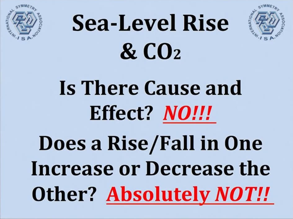
Now, on the last page, I have my conclusions. I am very pleased that you don't have to figure these out. These are the cause and effect? No! Between sea level rise and CO2. And does the rise and fall in one affect the other? The answer is absolutely not.
But now you see something interesting, and I want to talk about what's really important, research that needs to be done, and needs to be supported -- and not billions of dollars spent on sea level rise and CO2.
This is a look at the last three solar cycles. You notice, there's something unusual. They're usually, the peaks and valleys are about the same. You could set your calendar in the past on the 11 and 22 year intervals of these sunspots. And what happens is that you have the peak in sunspots, and it flips the magnetic field of the Sun. And then you have a diminution of sunspots, and then it rises again, and then the magnetic field flips back to where it was. So the magnetic field flip is 22 years, the sunspot cycles are 11.
Slide 13
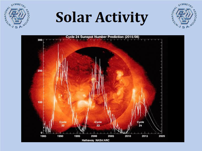 |
There are graphics on the internet you can see. They're called the butterfly effect, and you can see different ways of looking at the activity of sunspots, and it's been uniformly -- I shouldn't say uniformly -- it's been uniform for the last 100 years or so. And now all of a sudden, the peaks are starting to dwindle, they're going down lower, lower sunspots. What's worse, is that the interval between the peaks is beginning to stretch, so the 2005 to 2010 low period is much lengthier than it used to be.
If you look, and the reason the print job is so nice here, is because you can actually see this. If you go back to the minimum in 1987, you see there were two times where sunspots went back to zero -- no sunspots at all. In 1998, you had one. In 2008-2009 you had five intervals where there were no sunspots at all. And this is the length of time of this activity decrease happened. And now the next peak is just about half of what it should be, and it's coming down. We may end up being now in a 13- and 26- year cycle. This is a massive change. Do I have about 3 or 4 more minutes?
Q: Yeah, sure.
Wysmuller: I want to talk to you about something that happened. If you read the Washington Post, you certainly know what happened. A friend of mine, a colleague of mine, Willie Soon; Willie Soon is a doctor, a researcher at Harvard Smithsonian. Last February, when this became evident, there was a coordinated attack on Willie. The New York Times, Boston Globe, Washington Post newspapers, the L.A. Times, all over the country -- within one week! -- They all came out with stories that Willie Soon, at Harvard Smithsonian, is accepting oil money for his research. They were nice, they called it petrochemical dollars, that's OK. But you understand where it was coming from. By the way, nobody attacked the hundreds of papers that Willie has published, attacked any accuracy in any paper. The research was impeccable. It was beyond challenge. But what they did say, is that he's accepting money from oil companies. The truth is, Willie was working for Harvard Smithsonian. Harvard Smithsonian was accepting grant dollars from many organizations that were supporting research, including some oil companies. Willie never got paid by any oil company. Willie got a salary from Harvard. That was it! He was paid by Harvard Smithsonian and under contractual obligation not to mention the sources of his funding, if he knew what they were. And he only knew what they were about half the time. Again, the research was never challenged.
Why was this done? My theory, and this is my theory, is that it became painfully obvious that there was something really wrong going on with the Sun. They did not want the world's leading expert on solar activity, and Willie is the world's best, they took him out of circulation. For the next couple of months, Willie had to defend what he was doing. He was not doing his research. He was not making statements to the press. Harvard Smithsonian supposedly did an internal investigation. Did you ever hear the results? You didn't, because Willie was absolutely blameless! And we knew it, his colleagues knew it. But he's gone, he's out of the discussion.
He's back, by the way. He's writing papers again, and he's doing research, but you didn't know about this solar activity decrease. And if you're hearing about it now for the first time, that's a terrible shame! A terrible shame. Down at Johnson, we knew about it, because we talked about it all the time. This is not a new graphic. This is a NASA graphic. But the public just wasn't clued in. It is absolutely shameful. It is character assassination. Again, his research was superb, impeccable, and he's one of the great minds to ever walk the face of the Earth. And this is what was done to him over a six-month, eight-month period. It can happen to anybody. I think it happened to someone you guys know, too. Thank you for your courtesy.
Q: What is his name?
Wysmuller: Soon. And he's a Malaysian guy, -- but he's brilliant. He spoke here in Washington, at a conference that I was at last June. And that's where I first met some of you guys. So anyway, that concludes my part of the presentation. Sorry about the slides, but I think you'll be able to see them on the internet. I'm going to email them to [the webmaster]. Yes, sir.
Q: I think I understand most of this, but the thing that concerns me though, is what is the projection into the future of the attack?
Wysmuller: Of the Sun?
Q: Of the Sun, yes.
Wysmuller: I can't tell you. I don't know.
Q: So we haven't been researching that?
Wysmuller: Yes! But that's where the research dollars should go.
OK, but we've not come up with sufficient data to reach a tentative conclusion... [crosstalk 29.19]
Wysmuller: You are absolutely correct. Now you have a drift, if I can call it that, not a drift in the solar wind, but there's the Maunder Minimum was that period in the middle ages where there were no sunspots, and that was the little Ice Age.
Keep in mind, the Sun shines on the Earth. Now the Sun's a sphere. OK, the Earth is 93 million miles away. It gets a millionth of the energy of the Sun, quite little, but it does get it. And when you have high sunspot activity, more of that energy comes here. No doubt about it! And we know that.
If you see these old Chinese woodcuts, a lot of them display blind people, because the emperors in that time, asked people to look in a saucer of water at the setting Sun and count the sunspots. And these people who made a career of it, ended up losing their sight. But the records were very, very accurate, and methodically kept. We know there were no sunspots during that 160- to 170-year period. And then, when the sunspots returned, that happened to coincide with the end of the little Ice Age.
Now remember, I said before, correlation is not causation. But there are likely areas for research. And this decrease in solar activity is a place that, I think, you as a citizen, should insist that we put some research dollars here. In fact, they ought to go to Willie Soon, and he can tell people where they came from.
Billington: I think what we want to do, is please keep your questions and formulate some good questions. We definitely want to have a good, rich Q&A session, after the two presentations. So keep them, and others, I encourage you to think of some questions so we have that kind of rich discussion after the two presentations..